Print Resources: A Guide to Using White Ink in Print and Packaging Design
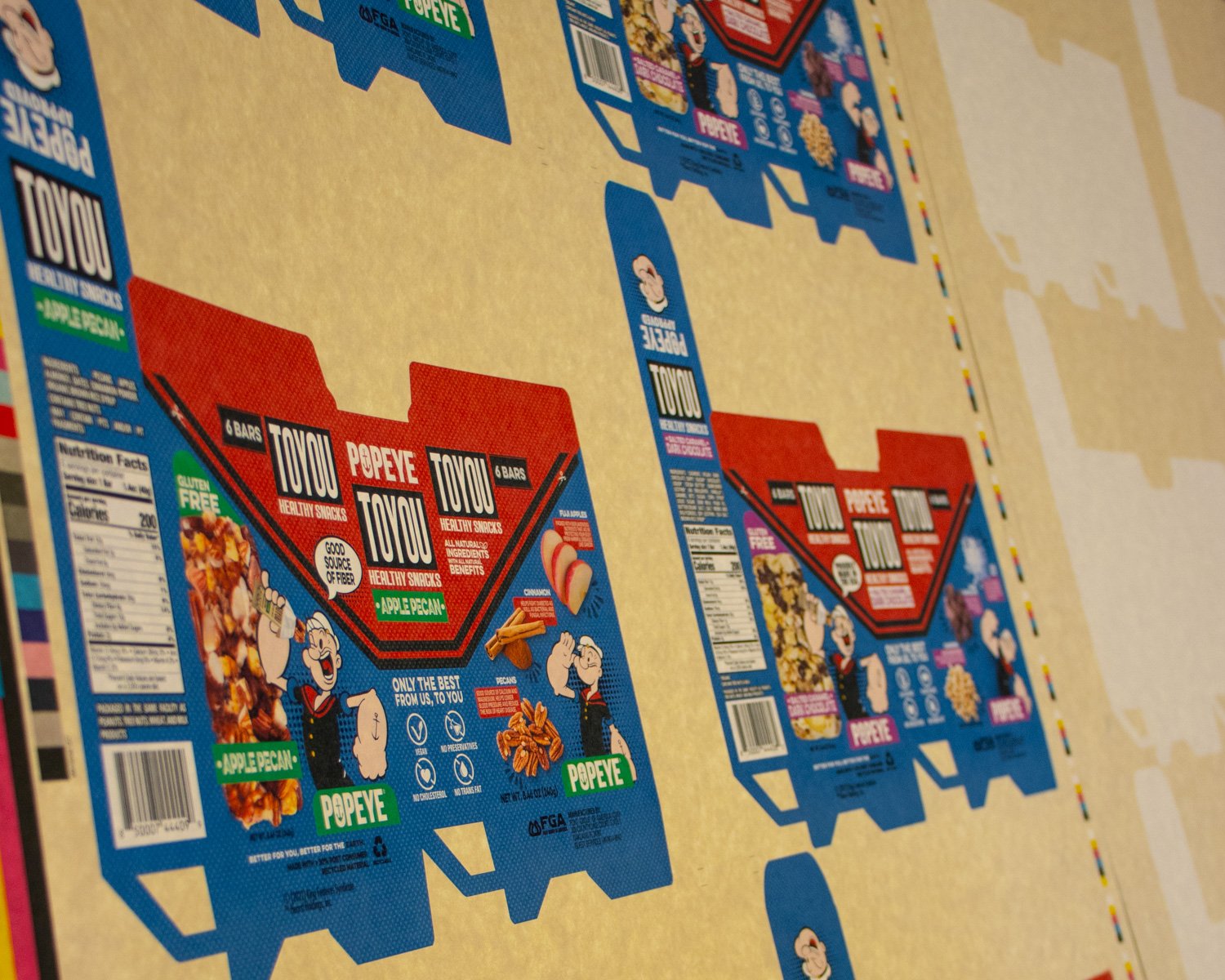
When it comes to commercial printing and packaging, there are many decisions to make, including the choice of ink. While most people are familiar with the four-color process of cyan, magenta, yellow, and black (CMYK), white ink is also an option. But how do you know when to use white ink instead of sticking to the four-color process?
Exploring the below advantages and disadvantages, step-by-step guide, and FAQs on using white ink in general commercial printing and packaging will help you to determine the best cases to use white ink in your project.
Why Is Design So Important?
I’m sure you’ve heard the phrase, “don’t judge a book by its cover.” While that’s an important rule in polite society, it goes right out the door when it comes to retail applications.
How many times have you chosen a bottle of wine, based on the interesting label alone? Or selected a new haircare product because the package stood out on the shelf against all others? Hopefully in those instances, you were also pleased by what was inside. But it only emphasizes the importance of great design to make your product stand out from the competition.
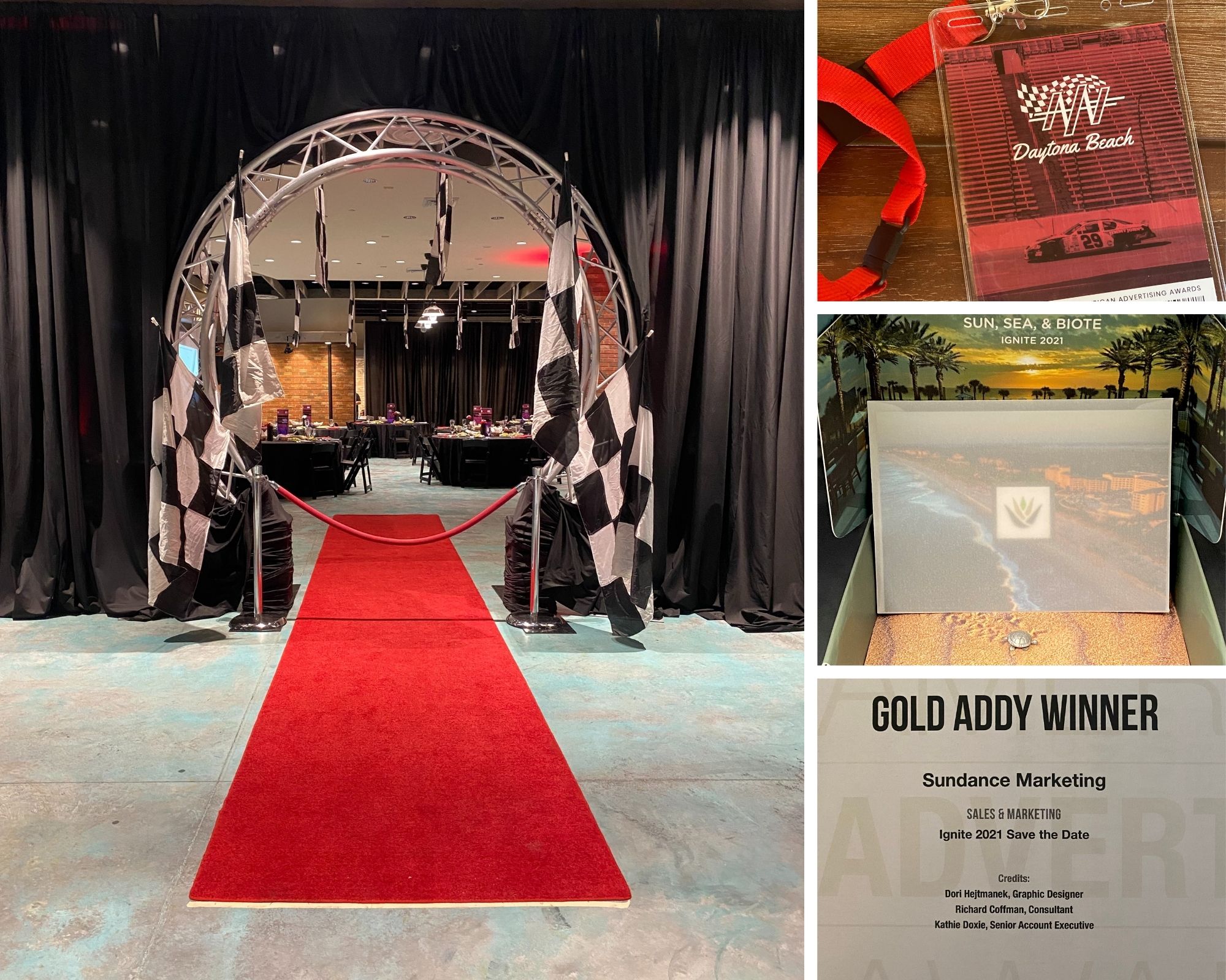
Gold ADDY Award WINNER!
SunDance is proud to be included in the elite group of winners of the 2021 Daytona Beach AdFed Awards! The American Advertising Awards, home of the ADDY Award, is one of the industry’s largest creative competitions, attracting nearly 35,000 professional and student entries each year. ADDY Awards serve to recognize and reward the creative spirit of excellence in advertising. We are so excited and grateful to have received such prestige recognition but we could not have done it without the help of our talent graphic designer, Dori Hejtmanek, our senior account executive, Kathie Doxie, and our fabulous account manager, Sheri Russo. They truly brought the client’s vision to life and drove home the beauty of the event’s location which was the main goal of the “Save the Date” package.
The Rebranding Process
After a number of years in business, a company may realize their previous branding is not serving them well and no longer aligns with their current objectives. Rebranding can pose a number of challenges, but it also offers a unique opportunity to re-evaluate, refresh and innovate.
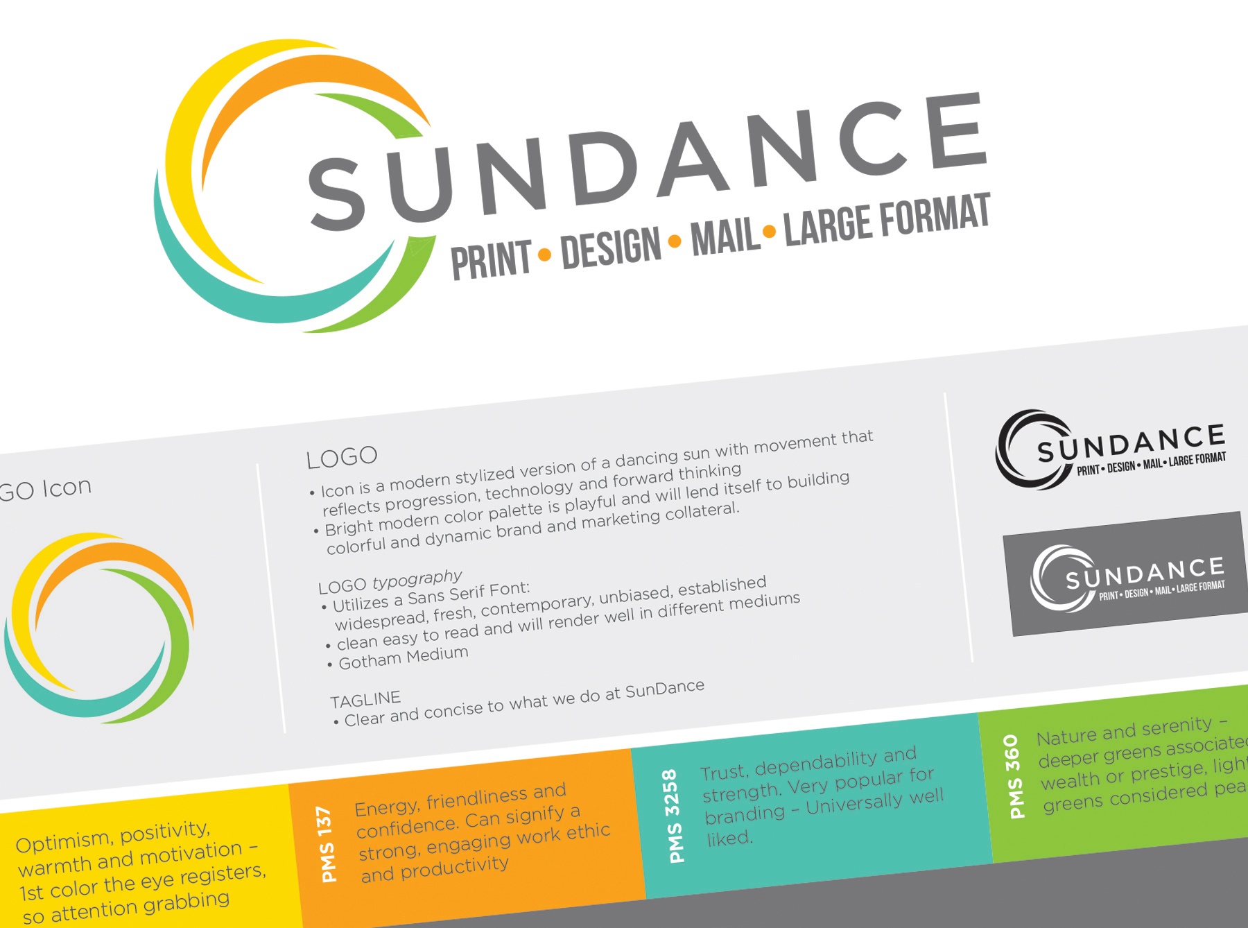
As our company and vision evolved, SunDance needed to update our branding to reflect our new outlook. We wanted our new look to reflect our progress, optimism and forward motion while paying tribute to our history
When we approached our rebranding, we needed to be clear and concise about our abilities and values. We updated our previous ‘sun’ logo to something more iconic and simple, but with the backbone of our history reflected. We used a bright and playful palette of colors that lend themselves to a number of dynamic branding opportunities. The fonts we chose are fresh, contemporary and unbiased—reflecting our experience and clear vision for the future.


